Colors and Branding
One of the prop types you can declare in your manifest.json is color. To your code, color is just a hexadecimal color code; however, when you use the prop type color it displays as a color picker in the editor, and it has access to all of the app's branding.
Example
{
...
"props": [
{
"name": "filledColor",
"displayName": "Filled Color",
"type": "color",
"default": "@primary"
},
]
}
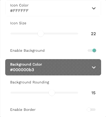
The color prop looks like this in the editor:
Branding List
In the colors prop, you can set the default value to any app branding prop. All of the options are:
- @primary
- @primaryDark
- @primaryLight
- @secondary
- @secondaryDark
- @secondaryLight
- @text
- @background
Contrast
You can also use the code @contrast to designate a contrast with a different color. Example:
{
...
"props": [
{
"name": "backgroundColor",
"displayName": "Background Color",
"type": "color",
"default": "@primary"
},
{
"name": "textColor",
"displayName": "Text Color",
"type": "color",
"default": "@contrast:backgroundColor"
}
]
}
In this case, textColor will, by default, be the best contrast with backgroundColor. This means
that if the background color is light, the text color will be black, and if the background color is dark, the text color will be white.