Control Types
These are some advanced properties you can add to your Adalo props to the way they look in the editor and how they interact with Adalo.
Prop-Type "Control"
You can add the key control to any Adalo prop, whose value is an object.
Slider
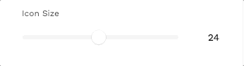
For example, if you want your number input to show up in the editor as a slider, you can add this control prop:
Which will make the number input look like this in the editor:
Each control object has the key type, which corresponds to the control type. The other values inside the control object differ depending on the control type.
You can find a full list of control types in the component manifest, but here are a few other common control types:
Menu
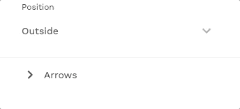
To make a prop show up as a dropdown menu, you can add the control type of menu:
Which will look like this in the editor:
Working with Adalo Lists (Role and Reference)
One data type a prop can be is a list, and often you want other props to be able to reference the current list item. In order to do this, you must add two properties to that individual Adalo prop: role and reference. See the example below:
In order to access the current list item as magic text within the action, you must specify both role and reference.
role should be set to listItem, and reference should be set to the name of the list property, in this case "listProp".
You can find more information about this in the component manifest documentation.
Disabling List Controls
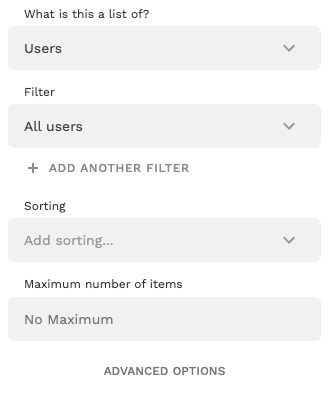
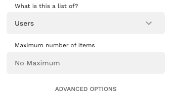
Makers have access to a number of controls when working with lists. If you wish to disable any of these controls, that can be done by adding the listControl prop to your manifest.json file. All list controls will default to being visible unless specified otherwise. Below is an example of how you can disable the option for a user to sort and filter the items in a list:
This will change the editor from its default appearance:
To this, where the sort and filter controls have been disabled:
You can find more information about the listControl prop and the different list controls in the component manifest documentation.